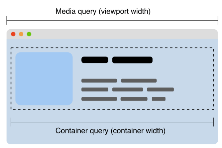
In order to make a responsive design, or at least to render elements nicely depending on the size of the viewport, we often use CSS Media Queries.
Container queries allow us to look at a container size and apply styles to the contents based on the size of their container rather than the viewport or other device characteristics.
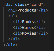
Let’s see a real-life example. I want to make a card, displaying a title and a list. And I want to display a bigger title when the container is wider than 400px.
Let’s write the HTML:
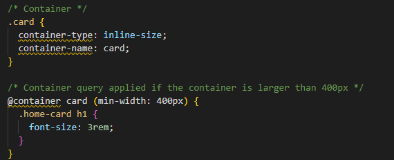
Then, the CSS. I define a 'container-type', which can be inline-size, size or normal. I set it to inline-size because I only care about the width here.
I can define a name for my new container, with the property 'container-name', so that it will be easier to use later on.
Finally, I can write the Container Query with the '@container' annotation. I use the container name "card" to specify what container I want to target. Here, the rule is simple: bigger h1 title when the container width is > 400px.
Here is the result:
When container width = 350px:

When container width = 450px:

🥳 Works fine!
The illustration below shows how the same card component can be displayed with multiple layouts using container queries:

This is a major CSS feature, which will be super useful in many cases!
Chrome browser supports it since version 105, Firefox does not support it yet. You can refer to caniuse website to have updated information.
Sources: